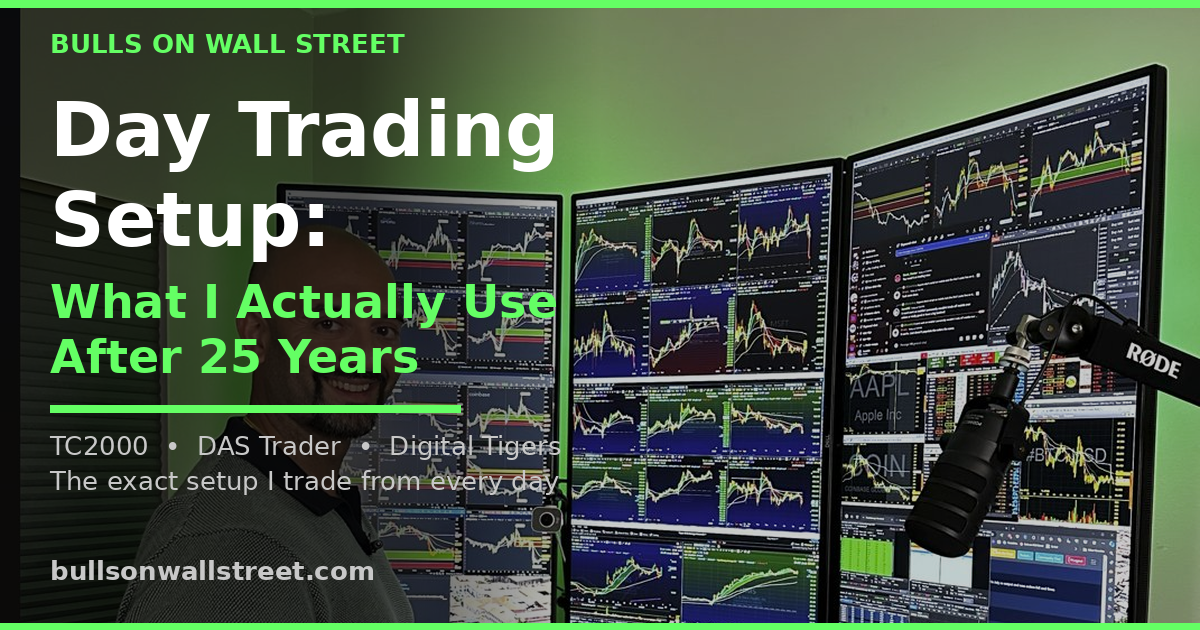


The TC2000 layout I trade from every day is two charts side by side, a daily on the left and a 5 minute on the right, with a news box and a rotating set of momentum scans underneath. Both charts run the 9 EMA, the 20 EMA, the 50 EMA and VWAP, with the space between the 9 and the 20 shaded into a cloud I call the Bone Zone. Above the charts sits a custom toolbar carrying market cap, float, next earnings date, and a stack of ATR readings that tell me in one glance whether a stock is still tradeable or already extended.
I have been trading since 1999 and full time since the end of 2007. I founded Bulls on Wall Street in 2008 and have trained more than 7,000 students through the live bootcamp. I have used TC2000 as my primary charting and scanning platform since 2007. Eighteen years on one platform means the layout you are about to see is not a theory. It is the screen I actually look at when my own money is on the line.
Kunal Desai trades from a two chart TC2000 layout, daily and 5 minute, running the 9 EMA, 20 EMA, 50 EMA and VWAP on both. The shaded cloud between the 9 and 20 EMA is the Bone Zone: green means the trend is higher, red means lower. His ATR Extension Rule states that a stock more than 7 ATRs above its 50 day moving average is disqualified from swing trades, and a stock 3 or more ATRs above its 90 day moving average is extended and prone to a snapback.
TL;DR
A chart layout is a system fingerprint. A trend trader screen and a mean reversion trader screen should look visibly different from each other. If your layout does not match your method, you probably do not have a method yet.
Everything belongs on one screen. The most common setup mistake is scattering the workflow across five websites. ATR on one program, gappers on another, options somewhere else. Every flip costs you the trade you were watching.
The Bone Zone is the trend filter. The shaded area between the 9 and 20 EMA. Green cloud, trend is up and pullbacks into it are buyable. Red cloud, trend is down. It works the same way on a daily chart as it does on a 5 minute chart.
The ATR Extension Rule decides what is still tradeable. More than 7 ATRs above the 50 day moving average kills the swing trade. Three or more ATRs above the 90 day moving average means a snapback can come at any moment.
Tear things out constantly. If I go a month without using an indicator or a toolbar field, it comes off the screen. Layouts get worse by accumulation, not by neglect.
The Two Mistakes Almost Every Trader Makes Setting Up Charts
I have watched thousands of students share their screens over eighteen years of teaching. The setup problems are almost always the same two, and neither one is about picking the wrong indicator.
Mistake one: nothing is at their fingertips
They are flipping around all the time. If they need to see an options chart, that is on a different website. If they need to check the ATR on something, they are opening a different program like Finviz. If they are looking at gappers, they are on Benzinga or StockCharts. They are not keeping a congruent layout that gives them everything they need at one glance.
Here is why that matters more than it sounds. Momentum trades resolve in seconds. A stock breaks out of a flat top, you look down to check float on another tab, and by the time you look back the entry is gone and the risk is three times wider. The cost of a scattered layout is not annoyance. It is missed entries and worse fills, every single day, compounding.
The fix is not complicated. Decide what you actually need to make a decision, then build one screen that has all of it.
Mistake two: indicators that do not match the system
People add things to their chart that do not fit their style of trading. If you are a trend trader, your focus should be moving averages and the tools that help you identify trends and the support and resistance inside those trends. If you are a mean reversion trader you would have a completely different group. You would be focused on oscillators, whether that is stochastics or MACD, things that help you find turning points, along with a different subset of indicators entirely.
Too many people do not think deeply about the actual system they are trying to build and what that system requires. They add a Bollinger Band because someone on YouTube had one. They add an RSI because it came with the platform. Then they wonder why their screen gives them conflicting signals.
My layout is a trend trading layout. I trade momentum and trend across timeframes, so my screen is almost entirely moving averages, VWAP, and volatility measurements. There is no RSI on my 5 minute chart. Not because RSI is bad, but because I am not a mean reversion trader on that timeframe and an oscillator would only give me reasons to fight trends I am trying to ride.
Look at your screen right now and ask what system it describes. If the honest answer is that it describes no system in particular, that is the real problem, and no indicator is going to fix it.
The Layout: Daily Left, 5 Minute Right
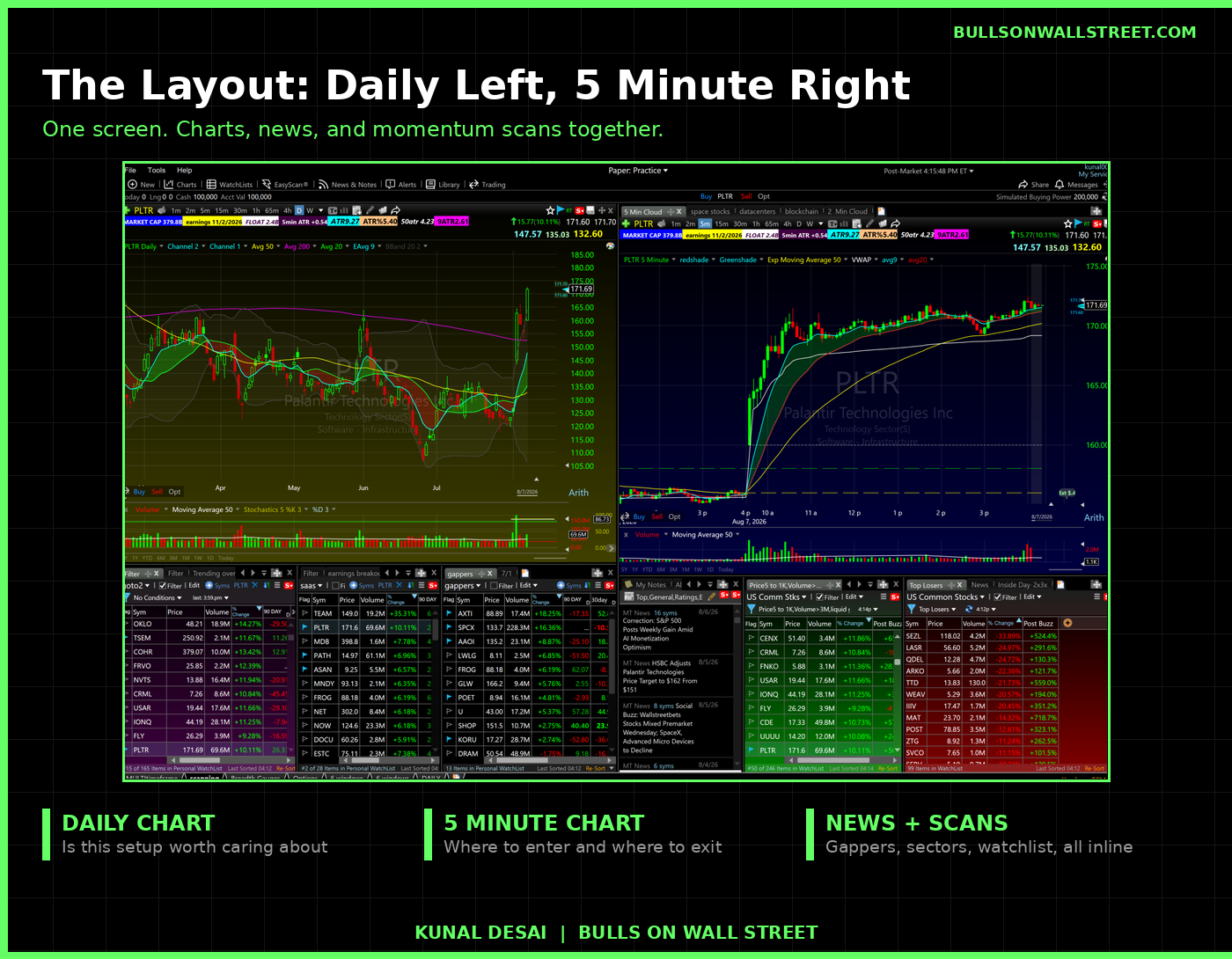
The main layout is a daily chart on the left side and a 5 minute chart on the right side. Underneath the charts I keep a box for news that connects to whatever ticker I have loaded, along with a subset of scans so I can flip through and find momentum stocks without leaving the screen.
The two chart structure is the whole point. The daily tells me whether the setup is worth caring about at all. The 5 minute tells me where to get in and where to get out. When I click a ticker from a scan, both charts change at once and I get the full picture in one motion instead of navigating between timeframes.
Both charts carry the Bone Zone. Both carry VWAP and the 50 EMA. But the daily runs additional tools that the 5 minute does not, because the daily is answering a different question. On the daily I have Bollinger Bands, stochastics, a 200 period average and price channels, which help me read where a stock sits inside its longer range. On the 5 minute I strip all of that out. Intraday I want trend and location, nothing else competing for my attention.
You can load my exact layout into your own TC2000 account here: the Bulls on Wall Street TC2000 layout. It opens directly in the platform, no download, no file to import.
The Bone Zone Works on Both Timeframes
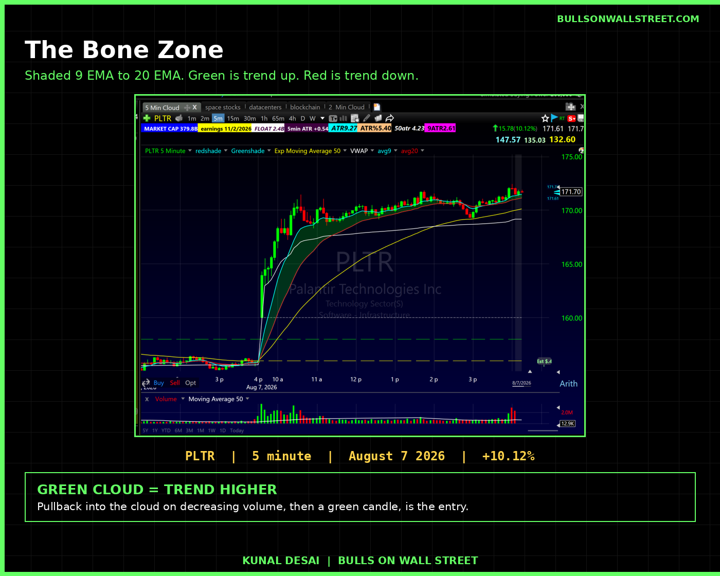
The Bone Zone is the shaded area between the 9 EMA and the 20 EMA. I shade it into a cloud so I can read trend without reading numbers.
Green cloud, the 9 is above the 20 and the trend is higher. Red cloud, the 9 has crossed under the 20 and the trend is lower. That is the entire read. A pullback into a green Bone Zone on decreasing volume followed by a green candle is my primary momentum entry, and I explain the full mechanics of that in my guide to the first pullback trading strategy.
What most people miss is that the same shading works on a daily chart. Same two moving averages, same cloud, longer horizon. A daily Bone Zone that has been green for three weeks is a swing trend. A daily Bone Zone that just flipped red is a swing trend ending. My specialty is momentum and trend trading, and the reason I can apply it to both day trades and swing trades is that the framework does not change when the timeframe does. Only the holding period changes.
Take PLTR on August 7, 2026. Up 10.12 percent on the day. The 5 minute Bone Zone went green at the open and stayed green through the entire session, with two clean pullbacks into the cloud that both held and both resolved higher. That is what a trend day looks like when you are reading the cloud instead of guessing. No indicator told me to buy. The cloud told me the trend was intact, and the pullbacks told me where.
The Custom Toolbar: What I Keep Above Every Chart
TC2000 lets you build your own toolbar across the top of the chart. This is the most underused feature on the platform and it is where my layout stops looking like everyone else.
Here is what I keep visible at all times.
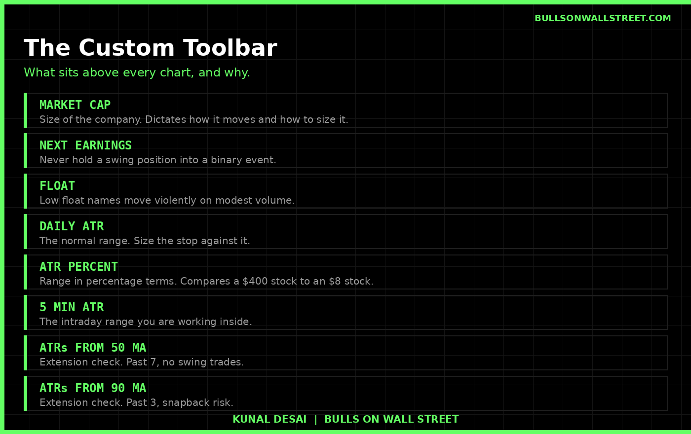
Market cap. So I understand the size of the company I am trading. A 400 billion dollar company and a 400 million dollar company move for completely different reasons and need completely different position sizes.
Next earnings date. The single fastest way to avoid holding a swing position into a binary event you did not know about.
Float. Low float stocks move violently on volume that would not budge a large cap. Float tells me what kind of range to expect before I size anything.
The ATR stack. This is the part almost nobody builds, and it is the part that changed my trading most.
The ATR Extension Rule
ATR is average true range, a measurement of how much a stock typically moves in a given period. Volatility is not a problem to be avoided in momentum trading. It is the raw material. But you have to know how much of it a stock has already spent.
I run five ATR readings in sequence across my toolbar.
The daily ATR, so I can see the normal range and size a stop against it. The ATR as a percentage, so I can see that range in percentage terms and compare a 400 dollar stock to an 8 dollar stock honestly. The 5 minute ATR, so I know the intraday range I am working inside. Then the two that matter most: how many ATRs the stock is away from its 50 day moving average, and how many ATRs it is away from its 90 day moving average.
Those last two measure extension. Here are my rules.
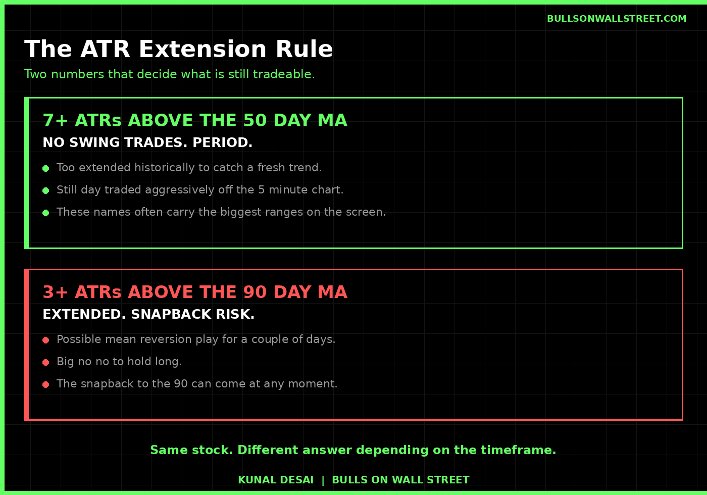
More than 7 ATRs above the 50 day moving average
If a stock is more than 7 ATRs above the 50 day moving average, I find that it is too extended historically to do any swing trades on it. Period. That is a hard line and I do not negotiate with it.
But here is the part that surprises people. Since day trades are based off the 5 minute chart anyway, I will still day trade it aggressively. Often those stocks sitting that far above the 50 have the biggest ranges and are the biggest trenders on the screen. They just do not fit my criteria of catching fresh trends, which is what a swing trade is supposed to be.
Same stock. Different answer depending on the timeframe. That is not a contradiction, it is the whole thesis. A swing trade is a bet on a trend continuing over weeks, and a stock 8 ATRs above its 50 day has already made most of that move. A day trade is a bet on the next two hours, and extension does not disqualify the next two hours.
Three or more ATRs above the 90 day moving average
If a stock is 3 or more ATRs above the 90 day moving average, it is getting extended. That makes it a possible candidate for a mean reversion play for a couple of days.
It is also a big no no to hold long, because the snapback to the 90 could come at any moment. That is the risk you are accepting when you hold something stretched that far from its own mean. Not a prediction that it will snap back. An acknowledgment that when it does, it will be fast, and it will not wait for you to be at your desk.
Parabolic names are where these two readings earn their keep, and I break down the full long and short playbook in my guide to how to trade parabolic stocks. This is also why I size these differently and why I lean on my risk management rules hardest on extended names. The 1 percent rule exists precisely for the trades where the range is wide and the snapback is unscheduled.
Two numbers. Two different behaviors. And they take about four minutes to add to your own toolbar once you know they exist.
The Scans Live Under the Charts
Underneath the two charts I keep a rotating set of scans. Gappers. SaaS names. Earnings breakouts. Trending over a period. A liquidity filter for common stocks between 5 and 1000 dollars doing over 3 million shares. Top losers, because the short side is a real part of the business.
Along the bottom of the platform I keep saved tab layouts for different jobs: multi timeframe, scanning, breadth gauges, options, six windows, and a daily focused view. One click moves the entire workstation into a different mode.
Here is the thing to watch for, and most traders miss it because their scans live in different places. On August 7, PLTR was showing up in three scans at the same time. Gappers, SaaS, and my personal watchlist. When a name appears in multiple independent scans at once, that convergence is itself the signal. It means the move is showing up in volume, in sector, and in the names I was already tracking.
You cannot see convergence if your scans are scattered across three websites. That is mistake one, showing up in the place it costs you the most. If you want to build scans that actually surface these names, I walk through my process for scanning for explosive stocks in detail.
Tear Things Out
I am always tearing things out of my TC2000. If I have a month where I just do not use a handful of these things, they are gone. No longer applicable.
This is the discipline nobody talks about. Layouts do not go bad from neglect. They go bad from accumulation. You add an indicator for a specific market condition, that condition passes, and the indicator stays on your screen forever, taking up attention and adding noise to every decision you make afterward.
Once a month, look at your chart and ask which of these things actually informed a trade. Not which ones you glanced at. Which ones changed a decision. Everything that did not, comes off.
My screen is more valuable for what I removed than for what I added. There is no RSI. No MACD on the 5 minute. No volume profile. Not because those are bad tools, but because I tested them against my own system and they did not change what I did. Technical analysis gives you hundreds of possible tools. A system needs six.
How to Build This Yourself
You can load my layout directly with this link, which opens it inside your TC2000 account. If you are still deciding whether the platform is right for you, I wrote a full TC2000 review covering pricing, the scanner, and where it beats and loses to the alternatives.
If you would rather build it from scratch, the order that matters is this. Set the two chart structure first, daily and 5 minute. Add the 9, 20 and 50 EMA and VWAP to both. Shade the 9 to 20 into a cloud. Then build the toolbar, and build the ATR fields last, because they are the ones you will actually make decisions with.
Then trade it for a month and start tearing things out.
FAQ
What is the Bone Zone?
The Bone Zone is the shaded area between the 9 EMA and the 20 EMA on a chart. It is a Bulls on Wall Street concept. Green cloud means the 9 is above the 20 and the trend is higher. Red cloud means the trend is lower. A pullback into a green Bone Zone on decreasing volume followed by a green candle is a primary momentum entry.
What is Kunal Desai's ATR Extension Rule?
A stock more than 7 ATRs above its 50 day moving average is too extended for a swing trade, though it can still be day traded aggressively off the 5 minute chart. A stock 3 or more ATRs above its 90 day moving average is extended and is a candidate for a short term mean reversion play, but a poor candidate to hold long because the snapback can come at any time.
What indicators does Kunal Desai use on his 5 minute chart?
Candlesticks, volume, the 9 EMA, the 20 EMA, the 50 EMA, and VWAP. The area between the 9 and 20 EMA is shaded as the Bone Zone. Nothing else. No oscillators on the intraday chart.
Why is the daily chart set up differently from the 5 minute?
The two charts answer different questions. The daily determines whether a setup is worth caring about, so it carries additional context tools including Bollinger Bands, stochastics, a 200 period average and price channels. The 5 minute determines entry and exit, so it is stripped down to trend and location only.
Can you export a TC2000 layout as a file?
No. TC2000 does not export layouts as downloadable files. Layouts are shared as links that open directly inside the recipient's TC2000 account.
What should be on a day trading chart?
Only the tools that match your system. A trend trader needs moving averages and the support and resistance inside trends. A mean reversion trader needs oscillators such as stochastics or MACD to find turning points. Adding both produces conflicting signals and no edge.
Why keep market cap, float and earnings date on the chart toolbar?
Market cap indicates how the company will move and how to size it. Float indicates the expected range, since low float names move violently on modest volume. The next earnings date prevents holding a swing position into a binary event.
How many ATRs above the 50 day is too extended?
More than 7. At that point the stock is disqualified from swing trades because the fresh trend has already been spent, though the same stock often remains an excellent day trading candidate because of its wide range.
What is the biggest mistake traders make setting up charts?
Scattering the workflow across multiple websites and programs, so ATR is on one platform, gappers on another and options somewhere else. Every flip between screens costs entries and widens risk on fast moving trades.
How often should you change your chart layout?
Review it monthly and remove anything that did not change a trading decision in the past month. Layouts degrade through accumulation, not neglect.
Does the Bone Zone work for swing trading?
Yes. The same 9 and 20 EMA cloud applied to a daily chart reads swing trend the way it reads intraday trend. The framework does not change with the timeframe, only the holding period does.
What does it mean when a stock appears in several scans at once?
Convergence across independent scans is a signal in itself. It indicates the move is registering in volume, in sector and in previously tracked names simultaneously, which is only visible when scans live on one screen.
Where can I get the ATR Extension Rule as a reference sheet?
Both thresholds and the steps to add the ATR columns to a TC2000 toolbar are available free inside the Bulls on Wall Street community, alongside the 7 Day Foundations Sprint covering charts, risk rules, scanning and execution.
Trade This Layout With Me Live
Reading about a layout is not the same as watching someone make decisions on it in real time. In the 60 Day Trading Bootcamp I trade live every morning, share this exact screen, and walk through why I am taking or passing on each setup as it happens. If you want to see the Bone Zone and the ATR stack used on live money rather than described in a blog post, that is where it happens.
Apply for the 60 Day Trading Bootcamp
If you are not ready for that yet, start free. The Bulls on Wall Street community is free to join and includes the 7 Day Foundations Sprint. You can also join me every morning in the BullsVision trading chatroom, where day trading, swing trading and options all run under one subscription. And if you want the pattern reference I keep beside this layout, grab the free candlestick patterns PDF.
About Kunal Desai
Kunal Desai is the CEO and founder of Bulls on Wall Street. A professional trader since 2007, he has navigated every major market cycle, from the 2008 financial crisis to today high-volatility environments. Having mentored 7,000+ students through his live trading bootcamps, Kunal trades live every morning in the Bulls on Wall Street Trading Chatroom and is dedicated to teaching real-world execution and high-probability strategies. Based in Miramar Beach, Florida.